Understanding Doppler Radar
When viewing the local weather report on television or referencing your favorite weather app, reviewing the radar data is an important component of ambient weather connections. Most of the time, the radar display only shows a sweeping line moving clockwise in a defined area. However, when there is precipitation nearby, and especially when severe weather is in the area, the radar is suddenly alive with a lot of colors and movement.
The radar is a complex tool. It is vital to National Weather Service operations as it is the tool meteorologists use to inform the public of any hazardous weather in their path. Specifically, Doppler radar analyzes the direction and speed of winds in thunderstorms, and meteorologists use this information to issue severe thunderstorm and tornado warnings for an area.
HOW DOPPLER RADAR WORKS
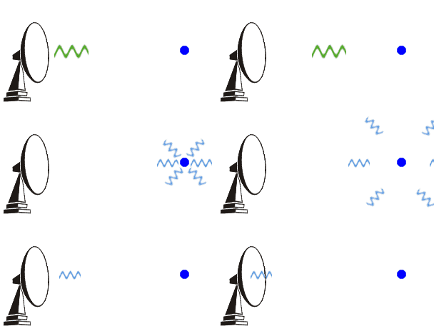
The radar transmits pulses of microwave radiation. Part of the energy of each pulse bounces off raindrops, insects, snowflakes, etc. back to the radar. Meteorologists analyze the strength of the returned pulse and the time it took to travel to the raindrop and back.

BASE REFLECTIVITY
The most visible and recognizable component to the Doppler radar images you see on TV is the base reflectivity imagery. These types of images paint the picture of what is occurring nearby. No matter what the precipitation type is, radar images rely on a lot of different colors to indicate the precipitation's intensity. The colors represent the strength of returned energy to the radar expressed in values of decibels (dBZ). The color scale is located at the lower right of each image. As dBZ values increase, so does the intensity of the rainfall.
Despite the vast improvements to Doppler radar over the years, it simply cannot read everything. The reason for this is relatively straightforward. The radar is projected about 0.5° off the ground. The radar scan "sees" the lower parts of storms when they're close to the radar and higher parts of storms when they're further away from the radar (due to Earth's curvature). The radar then tilts upward and does another rotation for a higher elevation scan. This process repeats several times, depending on which scanning mode it's in.
At an increasing distance, the radar is viewing higher and higher in storms, and the beam may overshoot the most intense parts. So, when meteorologists monitor storms that are quite a distance away, the radar beam will miss any information in the storm's lower levels. These radars' limitations may make you wonder how meteorologists can accurately warn on a storm located quite a distance away. There is a workaround to this issue. National Weather Service meteorologists can select an adjacent radar, typically located around 200 miles away, which may offer a more advantageous position to sample storms. Also trained storm spotters (members of the public who attend special classes each year to learn how to discern various weather phenomena) often act as the "eyes and the ears" of the National Weather Service and relay reports of such weather phenomena.
VELOCITY
What separated the Doppler radar from the previous generation National Weather Service radars is its ability to detect motion. Although Base Reflectivity is important to diagnose precipitation intensity, this is only half the picture. Meteorologists rely on velocity imagery to indicate whether there is rotation within a storm, detect strong winds from storms, detecting the speed of frontal boundaries, and even the general motion of winds near the radar.
Base velocity, like Base Reflectivity, provides a picture of the basic wind field from the lowest (0.5°) elevation scan. But to see the wind, there needs to be radar "returns" before the radar can determine the velocity. Remember, the radar beam elevation increases with increasing distance from the radar. Therefore, the reported value will be for increasing heights above the Earth's surface.
Also, know where the radar is located in the image. The radial velocity colors only have the proper meaning if you know how it is blowing relative to the radar's location. Outbound winds (red colors) on one radar might be inbound winds (green colors) at an adjacent radar. If the radar cannot determine if the winds are inbound or outbound, this data shows up as purple.
PUTTING IT TOGETHER
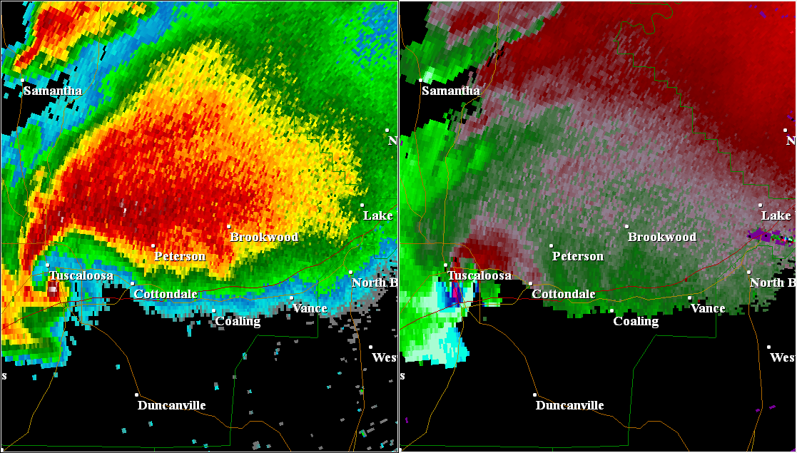
The above text gives a good basic understanding of the Doppler radar. Now let's see how National Weather Service meteorologists use these two radar depictions to warn on a tornado. Even to an untrained eye, it is clear that something is going on in the images below. You see many oranges and reds in the left panel, indicating intense rainfall. In the Base Velocity panel to the right, there is an area of green and reds converging together. This area is called an inbound/outbound couplet, and this is a very strong indicator of strong rotation within a storm. National Weather Service meteorologists spend a lot of time learning how to operate and interpret radar images. This is about as clear as it gets of indicating a tornado on the ground. Sure enough, these images were taken from the Tuscaloosa, AL tornado back in 2011.

Doppler radar is a complex and multi-faceted tool meteorologists at the National Weather Service rely on to do their job, which is to save the life and property of the public. Without Doppler radar, and trained meteorologists correctly interpreting its data, severe weather warnings would not be as timely and accurate as they are now. This will negatively impact the life-saving work National Weather Service meteorologists do for Americans.
